RD Magazine
Identity, Magazine Design, Media Kit
Smith worked closely with the publisher and editor-in-chief to launch a new trade magazine serving the high-end residential architect and custom builder audience. We provided naming consultation services in addition to design of the publication and its identity. To showcase the distinctive homes, covers feature little more than the identity, one focal image and minimal cover lines. The quarterly publication drew industry acclaim for its modern, clean approach, a welcome addition to the traditional trade market.
Category
Branding
Collateral
Related
Hartshorne Plunkard Architecture Monograph
Share This
Hartshorne Plunkard
Architecture
Anniversary Monograph
Marketing corporate milestones can pay dividends by enhancing client relationships and bolstering employee pride. HPA, an award-winning architecture, planning and interior design firm, chose Smith to compose its 30-year anniversary monograph. The gorgeous coffee table-style book celebrates the firm’s evolution, its passion for place making, and conveys its gratitude for the clients who make their work possible. The 170-page tome showcases the firm’s progressive work throughout the country, with its mix of design/build and rehab/revitalization projects. Content was written from extensive team interviews and brought to life with photography and architectural drawings.
Category
Collateral
Related
Share This
Lake Forest College
Admissions Viewbook
Working with Lake Forest College admissions and recruiting staff, Smith wrote, designed and art directed the photography for the school’s Viewbook. The impactful, oversized piece prioritized students’ educational outcomes—rewarding careers—by showcasing the benefits of the school’s outstanding career services program, comprehensive internship opportunities and accessible faculty.
Jones Lang LaSalle
Property Marketing + Content Development
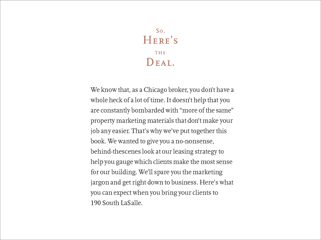
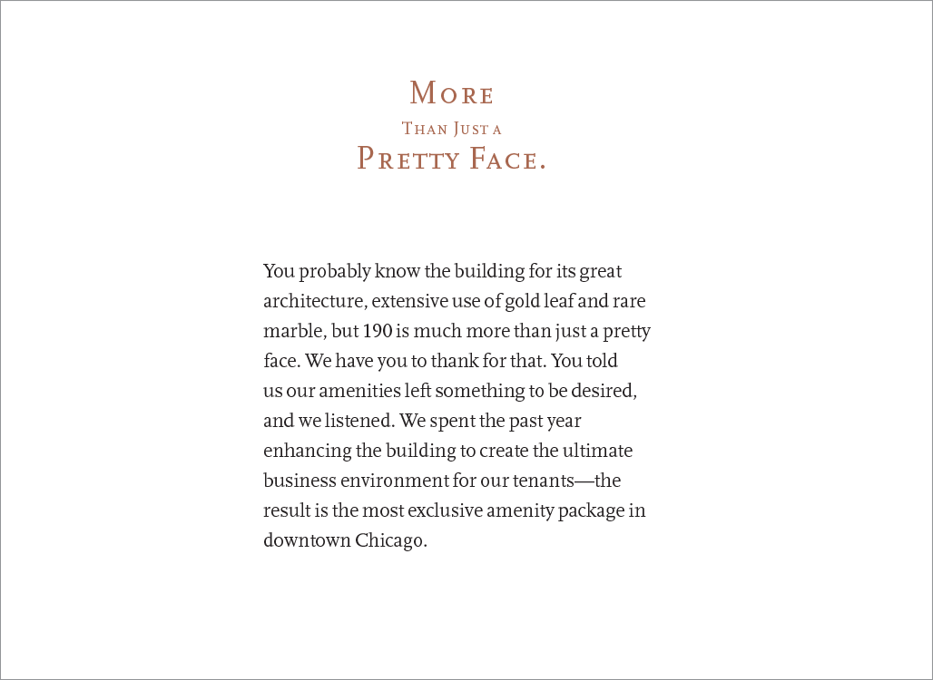
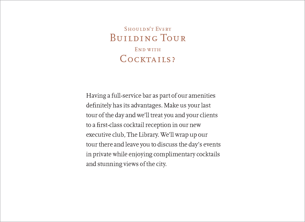
To differentiate 190 South LaSalle from other Class A buildings, we targeted its most influential audience—Chicago real estate brokers. Our goal was to communicate the building advantages and encourage new client tours. The campaign’s straight-shooting, conversational tone strives to impress without resorting to overt salesmanship. Results included increased broker interest, new property tours, signed leases and much-improved occupancy figures for the building.


